Thursday, 9 May 2013

Abstract or Pictorial?


Abstract Images means: (According to my free online dictionary)

Stylistically abstruse and non-pictorial  - free from representation

I searched on the internet for ‘Abstract Illustration’. Here is a good example according to the definition above.


This image below also came up in the search for abstract illustration. There was lots of these types of images. I found it interesting how the artists called their images abstract when they are clearly representational. They are stylised, but not abstract, they are not free from representation.


I had ago at my own abstract images. I made marks to music. These are marks made to Beethoven 5th Symphony. I had to listen to it about five times before I became comfortable making marks to represent certain sounds. The first ones I did were a mass of squiggles and that shows my lack of confidence, but the more I listened and the more I found the right marks. I found it helpful to work on bigger sheets of paper, this enabled me to edit it better and chose interesting marks for my album cover. I used dip pen and ink. I had two pens, one in each hand, one with a broad nib and one with a narrow one. The high notes were used by the narrow pen and the low ones were used by the broad one. I found I used the one pen at a time in certain places and simultaneously in others. Very cool experience.

This piece of music has an enormous amount of movement and is very complex. I chose a simple line that best described the movement of the song.

I was hooked and I tried other music like Cold Play and the Eurythmics.


Thursday, 22 November 2012

The Objective Of My Objective


My recent assignment was to illustrate seasonal fruit for point of sale. I chose a raspberry to represent summer time. The objective was to produce an image that reflected the quality and characteristics of a real raspberry.

I can honestly say that I was true to my objective and I spent hours drawing my raspberry. I did it over and over again until it was as right as I could get it. It was laborious and time consuming but I wanted to be loyal to the idea that an objective drawing means that its ‘presented factually and uninfluenced by emotions or personal prejudices.’

The irony is that the more I drew the dam raspberry, the more obsessed I got with it, it became totally personal and it influenced me emotionally. I also had feelings of prejudice towards the raspberry’s that didn’t make the grade. Was this really an objective drawing?


In the end, it looks like a raspberry, however there was a point where I just felt empty towards it, I couldn’t even finish it as I feared I may ruin it. Something was missing and I couldn’t see what it was.

I came across this quote by Picasso


This is where my objective changed; I had to push my factual representation into subjectivity so I could make sense of the reality. I had spent hours studying it, now it was time to see it my way.

I looked again at its structure, I wanted to draw the segments in rectangles as the segments are not all a circular shape, in fact, if you dissect it you will see we are looking at the distorted tops of squashed tear drop shapes. I didn’t put value on the green leafy bit at the top and I thought it should just be a line as rather than a solid leaf.


I still think this image is objective in the sense that it’s presented factually; indeed my raspberry still has segments that form a raspberry structure, and a leafy bit on the top. It’s also subjective because I drew what was in my mind and I turned what I knew to be a raspberry, into my own interpretation and from this process growth has taken place.

To see more of my fruit studies, go to my illustration section.


Mono print


Tuesday, 30 October 2012

Brian's ipad


I had the opportunity to visit Brian Grimwood’s exhibition at The Works Gallery in London. I had bought the book to accompany the exhibition before I went but I didn’t look through until I’d been. I didn’t want to travel all that way to see his exhibition, to have already seen his best work in the book. I thought it was a bit like when you see a trailer for a movie and when you go to see the movie, you have already seen the best bits in the trailer. Not only that, I didn’t want to have to pay inflated book prices in art galleries.

Anyway, I was gutted to find that when I got there, they were selling the book off cheap… typical. I felt smug with myself up to that point, and then I just felt stupid.

To my surprise, Brian Grimwood was actually there at The Works Gallery and he was going to talk to us about his work. It was a really good opportunity.

The first thing that struck me was how much like Picasso some of his drawing were. He had spent his life perfecting his technique into a strong, fluid, bold style that was very distinct and it can be spotted a mile away. He can really draw, and although his style appears free, when you see him work, its actually quite controlled.

He started work young and soon became freelance. He has worked all over the world and has established an illustration agency called the CIA.

His early work is clean and the quality is exceptional. It is clear he knows how to use his materials. His painting technique is so good, and in his gouache work, the colour is seamless and flat.

As his career progresses his work develops movement and his work then becomes what I can describe as painterly and stylized. He once described himself as a Commercial Artist and I think that’s right. Some of his work blurs a line between art and illustration and I like that.

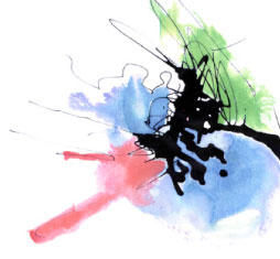
Some of his portraits are simple and brilliant. I really am drawn to his black and white images. I like the fact that I can clearly see his experimentation. He was very generous with the knowledge he has gained throughout his career. (Apart from how he got his gouache paint colour so flat, he kept that to himself.)

I could go on about how interesting I find it all; however, there is a ‘but’ in all this.

He has recently started working on the ipad. He has discovered that he can draw digitally using free apple software and upload it to his clients within seconds. He gave us a demo on how he does it. As he showed us, my heart began to sink. I thought to myself ‘ He is very excited about his ipad work but I think it’s a bit rudimentary.’ He was using digital brush tools and he loved it. He was working on one layer and changing colour's with his digital swatch.

My point isn’t to protest that he abandoning his drawing and painting skills for the digital art board, or that his digital brush strokes were obvious and sometimes tacky, but that he was raving on about his digital switch over as though people haven’t been designing solely on mac’s and pc’s for years. He saw his ipad as a separate tool from other computers. I just didn’t get it. He said he doesn’t like working in the Illustrator software, which I found hard to understand, but I think he likes his current software because it’s simple. I’m sure as he travels around, speaking to many young art students, I won’t be the only one to think this.

I then realized that if I was him, and I had built up my reputation and style like he had over the years, I could draw pretty much what I wanted and it would still sell and people would say how great it was. (Even if the brush strokes were tacky and the colour’s a bit limited - in a factory setting kind of way). To be honest, he can draw what he likes and it doesn’t matter anymore, quite simply because he is Brian Grimwood.

I follow Brian on facebook and despite my reservations about his ipad work, I can see why he has earned the right to be crowned the man who changed British Illustration and I respect that.

Following the Grimwood exhibition I went to Images 36. It was an Illustration exhibition at Somerset House. Image 36 is an independent, judge selected illustration competition organized by the Association Of Illustrators (AOI). It was established in 1976 to promote British illustrators. It showed work in varying techniques and genres, for example; editorial illustration, book covers and children’s illustration. One of Brian Grimwood’s book covers was there too.

The quality of the work was exceptional. I didn’t like every piece but I appreciated the quality of workmanship.

I felt as I looked at the digital work, I was justified in my reservations about Grimwood’s digital ipad work, but maybe I’m missing the point?

What did I learn from the day?

Well, I learnt that Brian Grimwood is a very professional, approachable man who knows his craft and is embracing change even in the later years of his career. I learnt that he likes serendipity and he said that accidents are good and when they look good, they can give birth to style. I also came to see clearly that if I was to make a career in illustration, I’m going to have to work hard. I could see the immense variety of styles around me and I feel very fortunate to be apart of the very clever, edgy, professional world of illustration. (Even though I’m not there yet.)

The best bit however, was the trip home. My friend and I talked about our work and we motivated each other to try harder.  You see, looking outward at others is really helpful and informative but looking inward at yourself is progression.


Friday, 19 October 2012

An animated tour of the invisible

Ive just watched this on TED. I really thought it is a great example of how illustration and animation can communicate meaning in an informative and humorous way.

Its only eight minutes long, so take time to watch it.

http://www.ted.com/talks/john_lloyd_an_animated_tour_of_the_invisible.html

Wednesday, 10 October 2012

Austerity and Invention


The Stanley and Audrey Burton Gallery
Austerity and Invention – Illustration between the wars.
This was a sequel exhibition to the 2010 exhibition "Fancy and Imagination: Aubrey Beardsley and the Book Illustrators".
Aubrey Beardsley had a very distinctive style with his decorative compositions and black and white stylistic lines and forms. Some of his works really well is and some of his work is grotesque and perverse. He influenced other artists like Jessie M King, but other artists were influenced by the Art Deco style of the 1920’s. Art Deco characterized elegant symmetries and clean dynamic lines, for many the simplicity of Art Deco reflected a certain austerity and a rejection of the Victorian extravagance. The styles of the times showed an imaginative response to the cheaper production values of the printing industry.
Some illustrators like Heath Robinson showed a great sense of humor in their illustration’s, perhaps to lighten the mood because of the war and great depression. This exhibition looked at a variety of media and styles used by artists between the wars.
I visited this exhibition twice. I just wanted to take it all in as I really appreciate this era.
What struck me most about this exhibition was the quality. It was just fantastic. There was work by William Heath Robinson, Edmund Dulac and Kay Nielsen to name but a few.
I could clearly see the difference between the illustrations of the past and contemporary illustration today. The subject matter and style is very different. Contemporary illustrators draw their inspiration many different pools of influence. They have the advantage of being influenced by technology in a way their forbearers didn’t. Victorians were from an era of development, and we are too, but our development is high speed. We can draw and upload and share in minutes. Printing restrictions inhibited that advantage back then. But saying that, Im sure the Victorians didn't have the 'right click' option on their mouse, so copying artwork would have been more difficult. 
Contemporary illustrators show more diversity in their style. However, despite their limitations, the Victorians had beautiful, sharp imaginations and their drawing techniques could give any contemporary a run for their money.
The similarities between the old and new era’s was just as clear. The quality and finish of the artwork was really strong. There seems to be a universal quality when it comes to good illustration. It can only come from diligent effort, and refinement of their craft.
It really was great to see, and I am glad I am influenced by the ‘age of enchantment.’ 

Wednesday, 19 September 2012

Can you help?

I am trying to collect the alphabet. I have no reason for doing this except it makes me very happy when I find a letter. It doesn't have to be an actual letter, It can be something that looks clearly like a letter and it has to be found. Here are the letters Ive found so far and I just found a 'c' today on the roadside. If you find any potential letters laying around, please email me. (I know I'm sad but I cant help it, maybe you could support me in my sadness)


Thursday, 6 September 2012

Punch 1921

My grandfather was given this book called Punch 1921. It is a collection of articles and illustrations from Punch, or the London Charivari from July - December 1921.

Punch, or the London Charivari was a British weekly magazine of humor and satire established in 1841 by Henry Mayhew and Ebenezer Landells. It was most influential in the 1840s and 50s, when it helped to coin the term "cartoon" in its modern sense as a humorous illustration. It became a British institution, but after the 1940s, when its circulation peaked, it went into a long decline, finally closing in 1992. 

All the illustrations have captions and some are funny and some are very political. I may not know the specific historic context very well, but these illustrations are clever and give me a great deal of information. Indeed I read the pictures. The illustrators really knew their craft and they understood how to use visual metaphor to communicate in an effective way their readers.
I really think the illustrations in this book show the issues that effected Britain in 1921and they are also relevant to us in modern Britain.

I really like crosshatching and this book is full of skilful illustrations using just line. They range from delicate vertical lines to bold graphic crosshatching, depending on the message. I have gained a lot from this book and it has really stoked my passion for crosshatching.


I particularly like this one. Fitting for today's budget I think!


This too has relevance to today's climate

I really like the way words are used in the hatching.

 
A good example of how women's confidence was growing.